
 Introduction to CSS –
Cascading Style Sheets
CSS — Cascading Style Sheets — is, after HTML (HyperText Markup Language) the most important language used in designing pages for distribution via the World wide Web.
HTML is the basic underlying language used for every web page; it allows an author to include all the information required to communicate with the visitor. It also allows the information to be presented in appropriate ways on a variety of different media.
While HTML does allow some control of visual presentation it is limited in its scope but the gap is filled by using CSS which allows the visual presentation to be fully controlled.
CSS may be employed on any web page. Version 2.1 of CSS [Ref 2] is well established is almost completely supported by all modern browsers while the latest versions are starting to provide support for version 3 even while it is still in development.
Fundamentals
Exercise
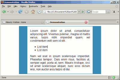
Here is an exercise that you can try, it shows just how easy and powerful CSS can be. If you want to try it, copy the following text into a text editor and save it as a file with extension .html Then run it in a browser.
"http://www.w3.org/TR/html4/strict.dtd">
Demonstration
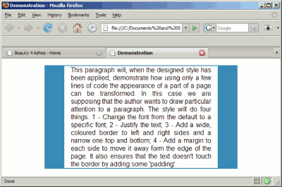
This paragraph will, when the designed style has been applied,
demonstrate how using only a few lines of code the appearance of
a part of a page can be transformed. In this case we are supposing
that the author wants to draw particular attention to a paragraph.
The style will do four things. 1 - Change the font from the default
to a specific font; 2 - Justify the text; 3 - Add a wide, coloured
border to left and right sides and a narrow one top and bottom;
4 - Add a margin to each side to move it away from the edge of
the page. It also ensures that the text doesn't touch the border
by adding some 'padding'
>
The result will probably strike you as pretty boring. It doesn't use CSS. Now go back to the text in the editor and add the following just before the end of the head area. That is just before the tag. Save and run in the browser again.
What you have done is defined style rule and added it to the file. If you save and run the file you will see exactly the same as before — Why? Because though you have defined a rule you haven't used it.
Go back and change the
tag to
Run it again. Now you should see what can be done. The rule you defined has been applied to the paragraph and the result can be seen in the browser. The result should be something like this.
Fig 1
By modifying the
tag for the paragraph and adding class="styled_with_border" you have applied to the paragraph the 'class' which you defined in the head. The paragraph is then formatted using the style definitions found in the head.
Object of this guide
That sounds like a bit of cook book design. It is there just to demonstrate how quick and simple using styles can be and the files are almost self explanatory even to the uninitiated.
This guide is not here to teach cook book stuff; on the contrary I hope the reader will gain a firm basic understanding of the methods and principles involved in using stylesheets. It is an introduction to CSS not a complete guide, so there will be aspects that will simply not be touched on at all. I hope that will prove a strength rather than a shortcoming. By limiting the scope, which is pretty wide anyhow, readers should be able to concentrate on the essentials. Once opened up you should be able to grow your skills in this fascinating area.
Assumptions
Basic HTML
Text editor
Patience
Let's make it clear. To use this guide you need to be familiar with using your computer including its file system and to have some understanding of HTML. You are not expected to have an in depth knowledge but, since CSS is applied through HTML, you do need a basic knowledge.
CSS is a simple language and its code can be created using a text editor. I will be showing examples of how the code will look so you may find it helpful to have a text editor available for use.
Even if you are using a wysiwyg authoring tool you will gain a better understanding of how it works and how to use it if you have some knowledge of what it is doing. A good one which is 'open source', costs you nothing and includes a CSS editor is .
One other thing you will need is a little patience. You have already seen a demonstration of what styles can do, but to start putting styles to use yourself you need to go through some basics first. If you are using a good editor this phase will be quite short but if you are handcoding inevitably you need to go a bit deeper because you have nothing except yourself checking your code as you go. Make a mistake by substituting ( for { or ; for : or omitting any of them and it can take you hours to find a fault.
If you prefer to handcode the CSS file a very useful tool is Active State Komodo Edit [Ref20]. It is basically a text editor but it will autocomplete CSS properties and underline incorrect rules so it makes bug chasing very easy.
A short refresher on HTML Attributes
ELEMENT
HTML elements are the basic blocks used to build web pages. Examples are 'p' for paragraph 'img' for image. In a file they appear like
ATTRIBUTES
These may be used to modify or qualify elements in some way. Attributes can be assigned to all elements, often this is optional but sometimes it is essential. For example, to use an image you must specify the file to be used as the source of the image otherwise nothing will be seen. This is done using the 'src' attribute of 'img'. For example

Note:
- The attribute appears in the opening tag for the element (as it happens the img element does not have a closing tag.
- The attribute has two parts—the name (src) and the value (images/sheep.jpg)
- The value is enclosed in double quotes. (In some very simple cases these may be omitted.)
- The attribute name and value are connected using an equal sign.
Some attributes, such as the above, are quite specific to particular elements but there are three that may be applied to any element in the body or indeed to the body element itself. These are
- style
- class
- id
We will see later how these may be applied but, just to give you an idea, here is one example of each.
Text in a paragraph
This heading is centred
Style Basics
Let's look at some basics first. It will be as well to become familiar with some terminology and to learn the syntax.
DECLARATIONS, PROPERTY, VALUE
Styles are applied using style declarations.
A declaration takes the form
property : value
in which a style property is associated with a value by listing them with a colon between.
Key to outlines and colours in use:
Some examples are:
The properties and values are taken from those specified in the CSS2.1 specification.
It is possible to use any number of declarations at the same time. When this is done they must be separated using semi colons e.g.
The lists may be written on a single line or, as is often done, on separate lines thus:
color : red ;

        font-size : 2em ;

        text-align : center
for this reason authors will normally add a semi colon at the end as well. This is optional but it tends to reduce the number of mistakes made when coding.
Note
- While the punctuation marks are essential, spaces are optional and will not affect operation but the hyphens in property names are part of the name and must not have adjacent spaces.
- Most properties can be applied to almost any element (generally those that will appear visibly on screen).
INLINE STYLES
The simplest way of applying styles uses the 'inline' method so we will look at it first. Please be aware that it is not a preferred method when others can be employed but it is permissible for occasional use.
Applying styles 'inline' is very simple using the html attribute 'style'. You just add a list of declarations as the value of the style attribute. For example:
Text in a paragraph
and the result will be
Text in a paragraph
There are several reasons why inline styles are not recommended. This will become clearer later but may be briefly stated
- Styles which are embedded in the code for the page, as are inline styles, are difficult to maintain, it may be necessary to search through a page and modify several to achieve an objective.
- The code involved can be quite significant and increase file sizes and download times.
- The code involved clutters the page thus anyone viewing the source may find it difficult to locate what is of interest.
This does not mean that inline styles should be prohibited. Occasional use is unobjectionable and is, in fact, the usual way of dealing with images.
Key to outlines and colours in use:
STYLE RULES and SELECTORS
Style rules collect one or more declarations together with a selector and provide a compact and powerful way to apply styles to a web page. Let's look at some examples:
Establishing rules and reusing them systematically helps to achieve consistency within and between the pages on a site.
CLASSES and IDs
The examples above show two different sorts of selector. The first, marked by starting with a full stop (period) is a class selector. The second, marked by starting with a hash (in US and Canada pound sign), is an id selector.
The list of declarations is surrounded by curly brackets (braces) thus separating the selector from the first property.
Classes and ids allow styles to be applied to particular elements in a similar manner to that used by inline styles, but the difference is that inline styles have to be repeated each time they are used. Classes and ids, having once been defined, may be re-used.
To apply a class or id to a html element use the corresponding attribute in the opening tag, for instance:
The first paragraph has bigger text
The first paragraph has bigger text
The footer appears less significant
Note that class name does not include the full stop and id name does not include the hash. These are used only for the selector.
Classes differ from ids. Classes may be re-used as often and wherever required. ids are unique identifiers which may be used once per page only. Typically they are used to define headers and footers, menus and main content areas of a page.
ELEMENTS
A very powerful feature of CSS is the ability to specify an element name as selector.
Example:
This will inset all unordered lists (ul) using a left margin of 5em thus improving legibility of the page.
When an element name is used as the selector nothing else needs to be done. That style will be applied to all instances of the element (though other methods are available to override this is needed). The result is that the code on the page is minimised making for a very clean appearance.
Having shown the code for style rules you may still be wondering where they are recorded so that the page uses them. That is where stylesheets come in.
Stylesheets
A style sheet (commonly referred to as stylesheet) is just a list of rules. Let's take an example:
body { margin: 15px 10px ;
       background: white ;
       color: black;
       font-size: small; }

body { font-family: Arial; }

p    { margin: 0.3em 0 0.3em 3em; padding: 0; }

ol, ul { margin: 0.3em 0 0.3em 6em; padding: 0; }
That's all there is to it. Usually, though not always, it consists of just ascii characters. Selectors and properties are case-insensitive as are most values but for some items such as font names and file names the case is significant.
The question is where does the sheet reside? There are two possibilities.
- External (linked) stylesheet
- Internal stylesheet.
External stylesheets
The preferred option is always an external stylesheet. This is because such a sheet can be used by several pages, or a complete site; should any error be found or a change required only one file has to be altered instead of having to trawl through all the pages to see what is needed.
An external stylesheet need contain nothing more than what is listed above. But comments are permitted and can be of assistance during maintenance. Here is an example:
/* rule added to sort IE6 bug */
Comments may be on a separate line or be inserted at the end of existing lines.
External stylesheets may be located anywhere which is accessible. It is usual to give them the extension .css It will probably confuse everybody if you don't.
Linking external stylesheets
External stylesheets must be linked to every page involved. The linking information is included within the HEAD area in the page source code. The usual and simplest way is using the link method.
Internal stylesheets
Sometimes it is required to include the stylesheet information within the code for the page involved. This may be easier, for instance, during development.
Again the code is contained in the HEAD area using the 'style' element with the 'type' attribute. For example to include the above stylesheet the code would be.
Multiple Stylesheets
You can have as many stylesheets as you wish for any page. The choice is yours but you will find it easier to keep control if you limit this to just a few.
Again it is simpler to keep the style sheets together in the head of the page but any internal sheet(s) may be mixed with external ones.
Later we will consider the priorities involved if we have several stylesheets applied to one page.
Relative references
Fig2
Folder structure
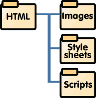
When designing websites there are no constraints on the folder structure used but something like that shown in figure 2 is fairly common. To insert an image in a html file part of the code might be:
which recognises the fact that the images are stored in a sub folder of the html folder so the url of the page file is expressed relative to that of the html file.
CSS files do not often call on external files in this way but in CSS2 it occurs in the case of background images and in CSS3 in other ways as well. When this happens the reference must be expressed relative to the location of the CSS file rather than the HTML file as explained in the CSS specification [Ref2 ]. As an example:
div.cloudy { background-image: url(../images/clouds.jpg); }
For CSS style sheets, the base URI is that of the style sheet, not that of the source document.
Setting up styles
Font size
We'll start with one of the most fundamental issues - How do you set the size of text? But before this we need to ask do we need to set text size at all? The answer to this second is in many cases 'No'. If you do not bother to set any size for text the browser will set one for you, it will set a standard size for body text, paragraphs and list items. Larger sizes in bold face will be set for headings and, what is more, there will be a remarkable consistency between browsers in the choices made. Perhaps even more remarkable is the fact that this approach is that adopted by W3C for most of its documentation so you will be in good company if you do the same. This approach leads to the use of slightly larger text sizes than typically opted for by those who make their own decisions but the advantage is that those with even slightly impaired vision benefit and the accessibility of the site is improved.
What then is the 'standard size' referred to above? It is 16px. This raises a new question what does 16px mean?
Here is some text with font-size set to 16 px – The Standard size, referred to. If you measure carefully you will not be able to find any dimension on any character which equates to 16px so is this just a myth? No. The line-height has also been set to '1' so the line height is the same as the font size. The background is ruled in 20px squares so, by measuring carefully, you can check that the line height is 16px. How much of the height, or font-size, is used by any character in the font is up to the font designer. In some cases the top of an upper case character or the ascender in lower case b d f h k etc will align with the top of the line-height measure while the descenders for characters like g j p etc will align with the bottom of the line-height measure. In other cases, such as in this sentence which uses the Calibri font, there may be spare space above or below so the text appears smaller even though though the font-size specified is the same. In fact there is no prohibition to a font requiring more height than the line height so that characters from one line actually overlap those of adjacent lines. For this reason line height is normally set greater than '1'.
If you do decide to set the font sizes for various elements you will discover that this is one of the more complicated aspects of CSS – so beware.
Font size can be set using a variety of units which behave in a variety of different ways.
- Leave set to defaults
- Pixels
- Absolute size keywords
- Relative size keywords
- em units
- Percentage
Using defaults
| Element | Size |
|---|---|
| body | unspecified |
| p | unspecified |
| li | unspecified |
| td | unspecified |
| h1 | 2em |
| h2 | 1.5em |
| h3 | 1.17em |
| h4 | unspecified |
| h5 | 0.83em |
| h6 | 0.75em |
| big | 1.17em |
| small | 0.83em |
| sub, sup | 0.83em |
The advantages of this approach have already been mentioned. If we do nothing the size resulting for various elements will be as defined in Appendix D of the CSS2.1 [Ref 2] specification with the sizes shown in table 1. All browsers appear to use these defaults.
Using pixels
Pixels have the advantage of being easy to understand but that's the end of the advantages. Whatever size the author may choose there is the risk, or rather the probability, that it will not suit some visitors. Because of this all browsers allow the visitor to change the text size, usually via the View menu. (This is quite different from the zoom effect that many browsers also offer because it changes the size of text only.)
Unfortunately Internet Explorer, even recent versions, does not allow the text to be resized if it is specified on pixels. This violates one of the important requirements of W3C's Web Accessibility Guidelines [Ref 35]
So – Never specify font-size using pixels
Value equivalents
Before going further it may be advisable to cover the relationship of sizes specified in different ways. On a new page without any other CSS structure the following all give text in the same size
Unspecified ≡ 16px ≡ medium ≡ 1em ≡ 100%
As we will see soon, once you apply structure to the page, such as creating divs or tables and apply font-sizes to them, the simple equation may break down.
Absolute size keywords
CSS has seven keywords that can be applied as values for font-size.
- xx-small
- x-small
- small
- medium
- large
- x-large
- xx-large
The ratio of the size between adjacent keywords is approximately 1:1.2 Since medium equates to 16px the total range is about 9 to 28 px or 0.58em to 1.7em.
Absolute size keywords may be simply and reliably applied to define font-size. A disadvantage is that the range of sizes available is quite limited, the smaller being too small for practical use and poor from the point of view of accessibility while the largest is still too small for some applications.
Relative size keywords
These are two in number.
- larger
- smaller
They are intended for use in conjunction with absolute size keywords and change the size to the next larger or smaller as appropriate. In practice they may be used with other methods of specifying font-size and typically change the size by ±20%.
em units and percentage
This is probably the most usual way to express font sizes, it is very versatile but you need to be careful if you are to avoid problems.
The first thing to realise is that there is absolutely no difference between using ems and percentage if you simply recognise that 1 em = 100%, 0.5 em = 50% etc pro rata.
The big question is 'What is an em?' In hot metal printing an em is the width of the letter 'm' so an em in Arial narrow typeface is considerably smaller than one in Wide Latin even if the point size is identical. Thus an em is not a fixed size. In CSS an em is not a fixed size either though for quite a different reason. In CSS the em is the same size for all fonts so is not related to the width of that letter. A better starting point is the one suggested above, an em starts off being equal to 16px.
| Element | Size | Size |
|---|---|---|
| body | unspecified | 16px |
| p | unspecified | 16px |
| li | unspecified | 16px |
| td | unspecified | 16px |
| h1 | 2em | 32px |
| h2 | 1.5em | 24px |
| h3 | 1.17em | 19px |
| h4 | unspecified | 16px |
| h5 | 0.83em | 13px |
| h6 | 0.75em | 12px |
The root element, that is the oldest ancestor, on any page is the HTML element. In this element – an em is equal to 16px. We'll deal with inheritance later but for now it suffices to say that any element inherits its font-size from its parent. Since the body element is a child of the html element it inherits the same font-size.
We could rewrite the default sizes expressing them in pixels and obtain the result in Table 2.
Now let us suppose that you prefer an easy life and do not want to redefine the sizes that a browser manufacturer had so carefully crafted for us, but you would still prefer the sizes to be slightly smaller. Let's say 10% smaller.
| Element | Size | Size | Revised size |
|---|---|---|---|
| body | unspecified | 16px | 14px |
| p | unspecified | 16px | 14px |
| li | unspecified | 16px | 14px |
| td | unspecified | 16px | 14px |
| h1 | 2em | 32px | 28px |
| h2 | 1.5em | 24px | 22px |
| h3 | 1.17em | 19px | 17px |
| h4 | unspecified | 16px | 14px |
| h5 | 0.83em | 13px | 12px |
| h6 | 0.75em | 12px | 11px |
This aim is easily achieved by setting the font-size for the body element to 0.9em (or 90% of course). The body inherits 1em at 16px from its parent but now converts 1em to mean 16 × 0.9px = 14px. All its children (p, li, hi, h2 …) take this as the size of an em and base their own sizes on this.
Font sizes specified in em or percentage scale in this way depending on the size of their parent. Sizes specified in absolute size keywords or px do not but remain constant throughout.
The effect is that an em is not a fixed size so, if you need any particular size, you must express it in relationship with that of its parent thus you need to keep track of what has gone before.
Font Family
Generic families
The font-family property specifies the typeface to be used. Traditionally authors have been limited to using fonts installed on the visitors computers and this is still the simplest and safest approach. This of course involves some element of guesswork and risk but is generally a reliable approach. CSS recognises five 'generic' types of font family
- 'serif'
- 'sans-serif
- 'cursive'
- 'fantasy'
- 'monospace'.
Specify one of these types and the browser will search the visitor's computer for a font meeting that description and use it. Use any of these, other than fantasy, and a reliable solution will be found (fantasy is very unreliable).
Font stacks
Rather than leaving all the decision making to the computer it is possible, and usual, to specify a font-stack, that is to say a list of fonts that you prefer to use. Here are a few common stacks as they would appear in a CSS declaration.
font-family: Arial, Helvetica, sans-serif ;
font-family: 'Times New Roman', Times, serif ;
font-family: 'Courier New', Courier, monospace ;
These provide alternatives of sans-serif, serif or monospaced fonts. In each case there are three values listed. The first is a font which may be relied on to be present on systems using MS Windows®, the second on Apple computers, the last is a generic type to be used if neither of the specified fonts is found. Font names must be spelled using the correct cases and names which include spaces should be enclosed in quotes.
Any number of font names may be included in a stack. The first found will be used if available.
In choosing fonts one issue is the range of characters, or glyphs, included. If you need more than a plain ascii set a good resource to check is provided on the web site of Alan Wood [Ref 26]. To find out how likely any particular font is to be found on Windows, Mac or Linux machines an invaluable resource is provided by .
The correct procedure for choosing which font from a stack to use is that the browser should search on a character by character basis. If the first font listed is found it should be used if it contains the character demanded otherwise later fonts listed should be searched. Some browsers appear to be more successful in this task than others. Until version 8 IE appears to select a font family even if it does not include a glyph for the character required.
Colour
Colour may be set for text, borders and background. The properties involved are
-
colorapplies to text -
border-colorapplies to borders -
background-colorapplies to background
Irrespective of whichever is involved the value is specified in the same way.
Colour names and codes
Colours may be described either by using a keyword or in R, G, B units, that is the proportion of Red, Green or Blue involved in the mix. (Some authoring tools may allow colour to be input using other systems of units — e.g. HSL, CMYK — but these will be changed into one of the systems recognised by CSS.)
CSS2.1 recognises 17 keywords for colour names:
Black
Gray
Maroon
Red
Orange
Yellow
Lime
Green
Teal
Olive
Aqua
Blue
Navy
Fuchsia
Purple
Silver
White
but CSS3 has a much larger set of names which are already supported by browsers and have been tabulated by O'Reilly [Ref 8].
Examples are:
color : fuchsia ;color : rgb(255, 0, 255) ;-
color : #ff00ff; orcolor : #f0f ;
The proportions of Red, Green and Blue are expressed as numbers in the range 0 to 255 either in decimal or hexadecimal using the structures shown in the example. The numbers are in the order Red, Green, Blue. When expressed as decimals the three numbers are separated by commas, when expressed in hexadecimal there is neither punctuation nor space between them. In hexadecimal when each component consists of two of the same digits this may be abbreviated. Thus #336699 may be expressed as #369.
Transparent colour
CSS3 introduces a new method of specifying colours. This method is the same as the rgb method but adds a fourth component, the 'a' (alpha) component specifying the opacity of the colour. The range for 'a' is 0 to 1 where 0 implies full transparency and 1 full opacity. For example:
p { color: rgba(0,0,255,0.5) } /* semi-transparent solid blue */
p { color: rgba(100%, 50%, 0%, 0.1) } /* very transparent solid orange */
Rgba is supported by all modern browsers other than Internet Explorer below version 9. (You can provide a level of support for browsers that don't support rgba by including a rgb colour prior to the rgba colour.)
There is a useful article on the topic at 24ways [Ref 9].
Background
A background colour or image may be set for any element. When the image is larger than the element it will be cropped to size. Where it is smaller it is possible to specify the position and whether it is to be tiled. For example.
h2 { background-image: url(images/bgfill.png); background-repeat: repeat-x; }
Tip
With XHTML pages background on the body element does not extend into the margin. To apply a background here set the style for the html element.
Images start at the top left of an element and by default repeat in both X and Y directions to fill the content area. The repeat action may be changed in the following ways:
background-repeat: repeat-x;background-repeat: repeat-y;background-repeat: none;background-repeat: repeat;
When a background image is used it is recommended that a matching background colour should also be specified. If the image is not available, or while it is loading, the colour will show which improves the visitor experience.
The background covers the content, padding and border area of an element. See figure later. The body element is an exception in that, for html pages, the background covers the margin area as well.
Links
Links are used to connect two points on the web. The source of a link is always the anchor element. The link is formed by modifying the 'a' as selector using a pseudo class.
Pseudo classes
Pseudo classes may be applied to any element but are most commonly used with the 'a' element. They are identified by using a single colon as the start marker. This has several states which are styled using pseudo-classes e.g.
-
:linkthe initial state of a new link -
:visiteda link that has been visited -
:hovera link over which the cursor is hovering
These classes are automatically applied to 'a' element without any author action and are acted on according to the state or history of the element.
The rules are set using the selectors:
a:linka:visiteda:hover
Make it clear
what is a link
what is not
By default, text links are rendered coloured and underlined and after visiting the colour may change.
In styling links one principle is important
- It should be clear to visitors what are links and what are not.
This is typically achieved by retaining the convention of underlining links and not underlining other text and also by introducing some change when a link is hovered over (to reassure visitors) e.g. removing the underlining, changing the colour or background. The browser will also normally change the cursor when you hover over a link.
An example of a set of rules might be
a:link    { color: blue; text-decoration: underline; }
a:visited { color: purple; }
a:hover   { text-decoration: none; }
If you do not want to differentiate links which have been visited you may need to override the browser default by setting the same declaration for the :link and :visited states. e.g.
a:link, a:visited { color: blue; text-decoration: underline; }
One thing that is important is to ensure that the a:hover rule is the last otherwise the others will override it.
You can find much more about styling links in my Lab note Maximise the value of your hyperlinks [Ref 30]
Layout
The next several sections cover different aspects CSS styles involved in page layout. They are not intended as a guide to layout itself which has been treated extensively in many articles by others.
CSS Box model
Fig 3
2-D Box model
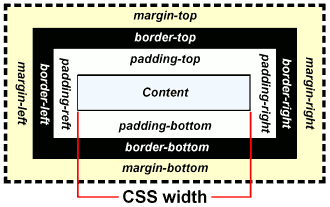
The box model describes the way several css properties interrelate. Margin, border, padding and content can be considered as a set of nested boxes. The illustration in Figure 3 shows the boxes with equal wall thickness all around. While this is the easiest way to set them up it is by no means necessary to do so and the labels show individual top, right, bottom and left properties which allow different values.
For most elements border and padding default to zero but many elements default to having a margin on top and bottom, others to left or right.
Margins and Margin collapse
If a bottom margin on a block element is set to, say, 0.25em and a top margin on the following block element to 0.5em then the gap between them will be the greater of the two NOT the sum. This is known as margin collapse.
For instance if the following rules were set:
h3 { margin-top: 0.5em; margin-bottom: 0.25em; }

        p  { margin-top: 0.25em; margin-bottom: 0.25em; }
then the space between two paragraphs would be the greater of 0.25em and 0.25em i.e. 0.25em
and the space between a paragraph and a following h3 would be the greater of 0.25em and 0.5em i.e. 0.5em.
Some unexpected results may be experienced especially where an element with a top margin is the first in a div. This is discussed in an excellent article by Eric Meyer [Ref 10].
Shorthand conventions
The components of the box model share several similarities. All have four components top, right, bottom, left and border has three sets of values.
| Property | Values | ||
|---|---|---|---|
| Margin | Width | ||
| Border | Width | Colour | Style |
| Padding | Width | ||
This leads to the possibility of having to set four declarations for margin:
margin-width-topmargin-width-rightmargin-width-bottommargin-width-left
similarly for padding while border may have twelve declarations. Several shorthand conventions assist here.
The property 'margin', border' or 'padding' used with a dimension as value will be interpreted as a width to be applied to all sides. e.g.
margin: 2em;- will provide the same margin on all sides
The clockwise convention allows different widths to be set for each side e.g.
margin: 0.25em 0 0.25em 3em;- will be interpreted such that the four values in turn apply to the width of the margin on top, right, bottom and left (running clockwise). Note there is no punctuation separating the values
If two values only are given the first will apply to top and bottom, the second to left and right.
If three values are given the first applies to top, second to left and right, last to the bottom.
The convention applies in the same way to border and padding.
For border the same applies to colour and style. If one, two, three or four valid colour or style values are listed the same interpretation will be applied. Note that each declaration can have one to four values not twelve. With one exception width, colour and style must be specified separately. The exception is when the border on all four sides is to be the same then one length one colour and one style — on any order — will define the border. e.g.
border: 4px solid #ffa500;
For possible border styles consult Sitepoint [Ref 14].
Table 4 above uses a combination of different border width, style and colours. Here is a set of declarations to do that:
border-style: solid dotted dashed double;
border-color: rgb(255, 204, 0) rgb(51, 204, 51);
border-width: 4px 10px 8px;
Three dimensional model
Fig 4
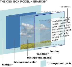
The box model as shown in Figure 3 is a two dimensional, flat model but it does have a third dimension which needs consideration.
The excellent descriptive diagram in Figure 4 showing the layering of background, image and content and also the transparency of margin and padding has been produced by Jon Hicks [Ref 13]
Advanced readers will know that if the size of the content area is constrained and more material than will fit is inserted the material will overflow the 'content'. The diagram shows that in that case it will appear in front of the border and (invisible) padding and margin.
Content size
The content area is where the text in a paragraph, heading or table cell or where the image in an element would go. Set a border on this of any required width and colour and space the border from the content by the padding. The whole structure is then spaced from adjacent material by the margin.
The size of the content area depends on the type of element involved and whether this uses the default setting or has been specifically set.
Default size
In the case of text items – headings, paragraphs and lists – the width expands to the full width of any containing block, which may be the body or some other element. This width will then often vary as the visitor re-sizes the viewport. The height of such elements will similarly vary so as to accommodate the given material.
Other elements may behave differently, tables for instance default to shrinking their width so as to be just wide enough to hold the content. If the space available is reduced the table height will alter. Similarly floated elements shrink to fit.
Set size
Fig 3 (repeat)
2-D Box model
The CSS properties width and height set the size of the content area. Once set this will override any default and any change with viewport width will no longer occur. Generally avoid setting these properties unless they are essential.
Authors should differentiate between the content area and the actual content. In the default condition both will be the same but when the height or width is set using a style it is possible that the data in the area may be either smaller or larger than the space provided. In such cases the content will simply overflow the area, usually in the vertical direction.
Overflow
Overflow can be controlled using the 'Overflow' property which can accept one of four different values:
Overflow: visible;- This is the usual default condition when overflow is not specified. The content will overflow the content area if required
Overflow: hidden;- The content will be clipped at the limits of the content area
Overflow: scroll;- Scroll bars appear on both axes allowing any overflowing content to be brought into view
Overflow: auto;- As for scroll but the scroll bar(s) appear only when required
Figures 5 to 9 demonstrate the various behaviours.
Fig 5
no

            style
Nam vel erat in ipsum scelerisque imperdiet. Phasellus tempor.
Duis enim risus, facilisis ut, semper eget, porta at, sem. Mauris tristique, orci sit amet scelerisque aliquet, nunc eros dictum wisi, non auctor arcu turpis id dui.
Fig 6
height:

            200px
Nam vel erat in ipsum scelerisque imperdiet. Phasellus tempor.
Duis enim risus, facilisis ut, semper eget, porta at, sem. Mauris tristique, orci sit amet scelerisque aliquet, nunc eros dictum wisi, non auctor arcu turpis id dui.
Fig 8
height:200px

            overflow:auto
Nam vel erat in ipsum scelerisque imperdiet. Phasellus tempor.
Duis enim risus, facilisis ut, semper eget, porta at, sem. Mauris tristique, orci sit amet scelerisque aliquet, nunc eros dictum wisi, non auctor arcu turpis id dui.
Fig 9
height:200px

            overflow: scroll
Nam vel erat in ipsum scelerisque imperdiet. Phasellus tempor.
Duis enim risus, facilisis ut, semper eget, porta at, sem. Mauris tristique, orci sit amet scelerisque aliquet, nunc eros dictum wisi, non auctor arcu turpis id dui.
Dimensions
When setting dimensions as the value of any css property for a box there are several systems of units that may be employed. For boxes width and height may be expressed as a length or percentage and lengths may be expressed using either absolute units or relative units.
Units
The value is expressed as a number of units immediately followed by a two letter abbreviation listed below.
- Absolute units
- in - inches
- cm - centimetres
- mm - millimetres
- pt - points (1/72) inch
- pc - picas (12 pt)
- px - pixels
- Relative units
- em - the font size
- ex - the x-height of the font
(W4C considers pixels to be relative units because they are scaled relative to the viewing device. I list them as absolute units because that is how they appear in practice.)
The most common choice are pixels or em.
The alternative is to use a percentage
- % - percentage
Percentage for width and height is measured in relation to the size of the parent element.
Pixels are easily understood and need no explanation.
Using em units is often convenient because they scale in the same way as font size.In practice this means that If you want a box large enough to hold 20 characters you can express its width as something like 10em (the actual number required depends on the font used and letter spacing). If the user alters the font size, the box width will automatically adjust to accommodate.
Negative dimensions.
Dimensions do not have to be positive. Cases vary but margins may use negative dimensions to reverse the action.
Maximum and minimum height and width.
Instead of specifying the height or width of a box you can specify one of
- min-width
- max-width
- min-height
- max-height
These are most often used for laying out major containers on a page.
Border-width
The cases considered apply to boxes. Borders also have a width dimension. This is usually expressed in pixels but may be in any of the length units listed above but cannot be in percentage.
Alternatively three preset widths are available
- thin
- medium
- thick
but there is no defined relationship of these to other width dimensions so it may vary from browser to browser.
Centring
Text may be centred using the declaration text-align: center; but this aligns the text within the content area, it does not align the content area. An example of text centred in a paragraph:
Centred text
uses the style declarations
border: 1px solid rgb(66, 137, 181); text-align: center;
An example centring the content area is:
Centred text
This uses the declarations
border: 1px solid rgb(66, 137, 181); text-align: center;
width: 6em; margin-left: auto; margin-right: auto;
That will take some unbundling. The border has been left as previously. The width of the paragraph has now been specifically set. Left and right margins have been set to auto. When this is done on any element whose width is known will be centred. The content box is now centred within the containing div and the text is centred in the box.
This usually means that the width must be specifically set but in the case of tables, provided that they do not occupy the full available width this is not required.
Of course what width do you need to set for the text? Since the visitor may zoom the text this seems unknowable. The technique is to specify the width using 'em' units. As the visitor zooms the text this changes the value size of an em so both text size and box width alter. To find the best value just experiment.
Block and inline
Almost all elements fall into one of two categories — Block or Inline. The exceptions are the parts of a table. Tables themselves are block elements.
Block elements
Paragraphs, titles, lists, tables etc are described as block items.
Each time you start a new block element …
It starts on a new line.
The background makes it clear where the content area of these blocks is.
Understand the difference
Inline elements are not the same as inline styles.
Inline elements are specific elements which display inline with other material
Inline styles may be applied to any element using the style attribute.
Inline elements
Some elements like strong, which was used here to make the type heavier, do not start new lines and are referred to as inline elements. The code
used would be like
 Some elements like strong
    , which was used here …
Images  are a very common example of inline elements. e.g.
Images
src="images/flag_united_kingdom.png" alt=""> are a very …
A special case of an inline element, which we will now meet, is the 'span' element.
Display
Although elements naturally fall into a category of block or inline it is sometimes possible to alter this behaviour. This is done using the display property. display can take one of three values:
display: block;display: inline;display: none;
A typical example of where you might like to make a change is to produce a horizontal list rather than a vertical list. A list is normally a block element each displaying below the previous. This behaviour can be changed by setting it to display: inline;.
Setting the value to none hides an element. This may be useful if you want to use a script or hover effect to reveal it. An element with display: none; is removed from the flow also can change the layout of a page. (Elements can be hidden from view without affecting the flow by using the visibility property with visibility: hidden; .)
Block, inline and display are discussed by Jennifer Kyrnin at .
and
'div' and 'span' are not CSS, they are HTML elements. The reason for considering them here is that, without the help of css, they can do virtually nothing. They are provided simply so that you can apply an attribute or rule to them. Remember that any element may be allocated a style, class or id.
- Div is a block element
- Span is an inline element
Span
For example, by adding a span and allocating it a style, I can make this text purple.
Use code like
this text purple
in the paragraph. Span is used where there is no inline element available to provide the formatting required.
div
The div element marks a division of a page. It is actually one of the most powerful and useful elements available for use in page layout. This will become clearer later when we consider positioning.
Recall the structure used in the first demonstration
Fig 1 (Repeat)
is a
block item
which can
contain other blocks
This allowed a single paragraph to be given a border and margins. What if we wanted several paragraphs, some lists and a few images to share the same sort of outline? If we apply the same class to each, at best we will get gaps between them and top and bottom borders for each. But what if we want them all to share the same borders, and perhaps background as well?
The answer is not at apply the class to the individual items but to enclose all of them in a division and to apply the class to that instead.
In the div we then include whatever we want along the lines
Paragraph1 content
- List item
- List item
Paragraph2 content
The result would be something like Figure 10:
Fig 10
Characteristics of div
To examine the characteristics of the div element I'll set one up with a background and border to make it easy to see. I'll use an inline style with the code
Text …
And the result is
Text in a paragraph within the division.
As you see it stretches nearly all the way across — it actually touches the edge of the padding on the containing (grey) block — It appears after the previous block and can hold some text.
Next let's add to the inline style so as to set the width of the div. width: 150px;
Text in a paragraph within the division.
Two things occur
- The width complies with the value set
- The height expands so as to accommodate all the content.
Of course now that I have control of the width I could centre the div by setting margin-left: auto; margin-right: auto; You will remember that to center something in this way you must first specify the width.
Text in a paragraph within the division.
I need a div that I can reuse later so I'll just set up a class so that I can use that.
.outlined_div { border-style: solid;
border-color: #4289b5;
border-width: 2px 4px 4px 2px;
width: 60px;
height: 60px;
background-color: #f4f8ff; }
I'll save that in my stylesheet then insert it into my file when I need it using the code:
And this is the result.
Recap
Let's just summarise what we know about divisions
- Tag name is 'div'
- They are block level elements
- They can contain other inline and/or block level elements
That's really all there is to know about them.
I'll be reusing the div quite a bit in the next section. There is no special reason for that, in many cases I could use almost any element, often I want an element that can hold explanatory text hence the div is chosen.
Positioning
I'm going to put the cart before the horse at this point and give you a summary table showing the characteristics of positioning schemes before I explain what they mean.
Table 5
Positioning properties
Position scheme
Properties which apply
Behaviour
toprightbottomleftwidthheightz-
indexNormal
flow
Scroll
Considered
Positioned
position: staticNo
No
No
No
Yes
Yes
No
Yes
Yes
No
position: relativeYes
Yes*
Yes
Yes*
Yes
Yes
Yes
Yes
Yes
Yes
position: absoluteYes
Yes
Yes
Yes
Yes
Yes
Yes
No
Yes
Yes
position: fixedYes
Yes
Yes
Yes
Yes
Yes
Yes
No
No
Yes
float:No
No
No
No
Yes
Yes
No
No
Yes
No
Normal flow
Normal flow
Order of code
≡
Order on screen
Look back at how a div was used for the structure shown in Fig 10 and at the code used. Compare with the image on the screen (or your own trial). You will note that the order in which items appear on the screen is the same order as that in which they appear in the code.
That is Normal flow — the order of the code is the same as the order in which it is displayed on screen.
Float
The next concept to be introduced is that of 'Float'. In discussing this I need two icons.
 Will show the position of the code for an element that has been 'Floated to the left'.
 Will show the position of the code for an element that has been 'Floated to the right'.
Float is one way of moving the position of where an element is displayed from where you might expect to find it. For the demonstration I will be using the outlined div previously prepared and I will put some explanatory text in the div to help.
Floated right
I want to use a div because it is a block item. Because this text is in a paragraph and because a paragraph (or any text block) cannot hold another block item I have inserted the div just before the paragraph just where the yellow icon appears. Normally that would mean that it was displayed between this paragraph and the previous, whereas in fact it is to the right of this paragraph. This has been achieved by applying the inline style style="float: right;"
Floated right
Floated left
The result of this is that the div moves to the edge of the space available (in this case the padding of the containing block) and the text wraps around it. I could just as easily have floated it to the left as here.
Notice that:
a - Not only does the block before which the item was floated wrap but all following ones do as well until the wrapping is no longer needed.
b - The floated items do not necessarily appear on screen in the same sequence as in the source code.
Floated left with margin
c - Items floated left and those floated right do not interfere with each other.
d - Text wraps around floated items but can just touch them which is quite ugly. You can add a small margin to improve the appearance if this happens.
BUT, BUT, BUT … you may be thinking. The box is created by applying a class to a div but I just said that float was achieved by applying a style.
There is no problem. For styling purposes you can apply to an element
- An inline style of any complexity
- As many classes as you wish
- One and one only id
But the cleanest designs always limit the number used and try to avoid inline styles.
The code for the last dem above is
class="outlined_div">
Floated left with margin
Moving on.
What floating does is move an item to the right or left as far as possible until it meets a barrier. So let's try floating several items. Soon after each other. I'll number each in the order in which it occurs in the code.
1
2
3
4
5
6
7
The first div floats to the right limit but the next floats till it meets the first. Others behave similarly.
1
2
3
4
5
6
7
8
9
10
What this means is that while right floated and left floated elements do not interfere with each other elements floated to the same side may. Of course there are times when this could be quite irritating. You would really prefer the divs to appear one below the other.
This is simply achieved by adding the declaration
clear: right;
The example at the right shows the result. Of course the divs now touch each other. To avoid this simply add a small top or bottom margin to each.
Table 6 summarises the relevant style properties and values.
Table 6
Float properties and values
Property
Possible Values
Float
Left
Right
None
Clear
Left
Right
Both
None
I've finished that topic but the accompanying diagrams are still running down the page and this text is wrapping to the left. It's quite difficult to start a new subject under these conditions but here's how.
Clear
In the next title or paragraph, or whatever, set clear right; or clear: both;
Floated elements
are removed from
normal flow
Setting 'clear: right;' ensures that the next item, whether floated or not, will appear below anything previously floated right. Similarly for left'. Setting 'clear: both;' ensures that it will; appear below anything previously floated.
This problem is much more acute on web pages than in desk top publishing or any paper publishing system. That is because on paper you know exactly where things are and so can manipulate items to make an attractive layout. On a web page the layout will depend on many factors outside of the author's control so you may have to put up with white space where you really would prefer not to have it.
Float is one of the more troublesome aspects of using CSS. The references include several articles on the subject including one by Eric Meyer [Ref 22].
Absolute and relative position
Absolute position
Absolutely positioned elements
are removed from
normal flow
The style property position : absolute; is a very powerful tool for use when positioning elements on a web page. Like float it removes elements from the normal flow and does so with a vengeance. Float is limited to moving things to the right or left (though if you apply top or bottom margin you have some control of vertical position also) and they never overlap. Absolute position acknowledges no such restriction and can make things appear anywhere on (or off) the page.
To apply absolute position apply the code
selector { position: absolute; top: value; left: value; }
The properties 'top' and 'left' are known as offsets and alternatives are 'right' and 'bottom'. The value can be specified in any length unit e.g. px, em, percentage.
Note: If you omit to specify an offset the element will remain in its normal flow position in that direction.
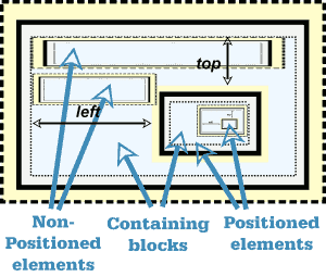
Containing blocks
The first question is from where are the values measured?
Fig 11
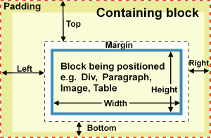
Every positioned element is positioned within some other element which is referred to as its 'containing block’.
Offsets are measured from the ‘padding edge'’ of the containing block (i.e. from the outer edge of any padding on the containing block) to the outer margin of the element being positioned.
What is the containing block?
I'm sorry, this is where it starts to get difficult but once you are through the woods you will see your way.
If you start a new simple page with little in it and position something using position: absolute; it will be positioned with respect to the viewport on the screen. If you are new to this I suggest you try it. You can set up a div or use an image or even a paragraph. Then give it an inline style like
style="position: absolute; top: 100px; left: 200px;"
Repeat with a copy but change the values slightly. You will see that there is no difficulty in getting things to overlap.
You could then change some of the offsets from 'left' to 'right'.
Fig 12
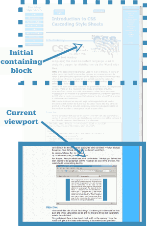
By now you will see that the positions are being set from the edges of your viewport — so the containing block is the viewport. Positioning is being carried out with respect to the viewport.
Add more text to your page so that there is sufficient to allow the page to scroll. Change some instance of 'top' to 'bottom'.
Now scroll the page. 'Left' and 'right' are still being interpreted with respect to the viewport but 'top' and 'bottom' are scrolling.
In fact all four offsets are interpreted with respect to the initial position of the viewport (before scrolling).
Absolute positioning is first carried out with respect to the initial containing block which, before scrolling, is the viewport.
Once you have scrolled the page the current viewport moves down the page but the initial containing block remains at the top of the page. Positioning is no longer with respect to the viewport. The figure on the right represents this situation.
It is of course still possible to set positions of elements by counting down from the top of the page but this is not always satisfactory.
If you are using a 'fluid design', that is one which does not constrain the page width but allows it to vary as the visitor changes the viewport width, items on the page will move up or down the screen and there will no longer be any correspondence between the item and any measurement in pixels or in fact any other measuring system.
If you then want to position something using Absolute positioning some way of re-basing the measuring point is needed.
Call in position: relative;
Relative position
Relatively positioned elements
remain in
normal flow
In contrast to elements with position: absolute; those with position: relative; remain in normal flow. That means that you can place something in normal flow, allocate it a style with position: relative; top:0; left:0; and it will stay where it was. In fact you don't even have to allocate any offsets at all.
A division is particularly convenient for this because it can hold other elements. Once you have set up a division with position:relative it can act as a containing block for other elements. Let's take an example of that now.
I have taken the styled div used previously and given it the opening tag
class="outlined_div"
style="position: relative; width: auto; height: auto;" >
By setting the width to 'auto' I have removed the width constraint embedded in the class (check back) so the div occupies full width of its container. Note that the inline style overrides the class.
So what I have is a division with position relative in which I can insert code in normal flow like these paragraphs and also floated items but which in addition could act as a containing block for something that I might like to position.
Let's set up an absolutely positioned div in this. I'll use a second copy of the outlined div just before this paragraph using the code
style="position: absolute;
margin-left: 38px;
left: -128px; top: 0px;" >
Because the inserted div is absolutely positioned it is removed from normal flow and doesn't appear inline with other items. Where is it?
It is positioned with respect to its containing div (this div) and since the value of top is 0px, its top lines up with the top of this div. The left offset is negative so it appears to the left of this div, in fact in the menu area so may be partially hidden. Clearly it is linked to this div because it scrolls with it.
Forming containing blocks
Only positioned elements
form containing blocks
So what can act as a containing block?
- Only positioned elements form containing blocks.
A block may hold positioned and non positioned elements but only those that are positioned act as containing blocks. It follows that
- Containing blocks may be nested to any degree.
 You will find that most commonly divs are used when we need to create a containing block for positioning. This is convenient because divs can hold other block items. However any element may act as a containing block and text blocks like paragraphs are quite suitable for positioning inline items like images.
What then is positioned?
This is easy. To be considered 'positioned' an element must be allocated the property 'position' with one of the values 'absolute', relative' or 'fixed'.
Note that floated elements are not considered positioned.
The subject is considered in more detail with many examples in my Lab Note on Absolute Positioning [Ref 28].
The body
You may have noticed that the body element has no part in the positioning regime. It is the nested positioned elements which take part rather than those in the code sequence.
Nevertheless it is sometimes convenient to position with respect to the body. It should be unnecessary at this stage to tell the reader how to achieve this. Style it with position: relative; If your page design uses a fixed width and is of no great length this may be a convenient way of laying out elements on it.
Fixed and static position
If you look back to table5 you will notice two positioning schemes so far not discussed.
Fixed position
Fixed position shares all the same characteristics as absolute positioning except that its behaviour differs. It does not scroll with the page. This is because it is positioned, not with respect to its containing block, but with respect to the viewport. So you can have an element that remains in view at all times in the same position on the viewport.
One issue which can result is of course that elements that scroll with the page may obscure or be obscured by fixed position elements. You just have to design any problems out with or without the use of z-index.
Static position
position: static is simply the default, original, positioning system in which everything is in the normal flow of the page.
z-index
The box model as described is simply a two dimensional model other than the micro-structure within elements described in the section on Three dimensional model. Clearly however with the possibility of elements overlapping, for instance when given position: absolute;, some elements may obscure others. In this case there may be the need to move an element up or down a level so that the right one is seen.
The default situation is that elements painted later, i.e. later in the code, are painted on top of those painted earlier. Where this does not give the desired result recourse to using the z-index property is available. z-index effectively moves an element in the third or 'z' direction. z-index may be applied to elements described previously as positioned. See also Table 5.
z-index is covered in detail in my Lab Note on Using Layers [Ref 31].
Selectors
Simple selectors
Earlier in the section on style basics we had a quick look at selectors. Now we need to add more detail. There we encountered three different sorts of selector:
Element selector e.g p or ul
Class selector e.g .paraone
id selector e.g. #footer
Multiple selectors
Multiple selectors are separated by commas
Where the same style is to be applied to several elements it is possible to combine several selectors into the same rule. Simply separate the selectors involved using commas. For instance:
p, li, td { font-size: medium; }
Descendant selectors
Where a page is divided into areas, for instance for menus or columns, you may wish to style elements in each area differently. These areas are typically contained in divs though the container might be a table or a list. Consider:
h2 { font-size: 1.4em; }
.menu h2 { text-align: center; font-size: 1em;}
The first rule sets the font-size for the h2 element. The alignment will be to the left, not because it is defined here but because that's how the browser defaults.
Components of descendant selectors are separated by spaces
The second rule sets the style for h2 elements that are descendants of an element with class 'menu' which contains an h2 element. The selector contains two components '.menu' and 'h2'. The components are separated using one or more spaces.
This element is usually a div and we could say so by changing the selector thus
div.menu h2 { text-align: center; font-size: 1em;}
This makes the selector more specific so that a h2 in a list with class menu will not be affected. We will deal with specificity.
We an combine descendent selectros and multiple selectors in a single rule by using the appropriate commas or spaces to differentiate them.
#page_menu h2, #site_menu h2 { text-align: center; font-size: 1em;}
Child pseudo-class selectors
The concept of 'children' is not difficult to grasp. For instance a list (ul) contains list items (li). The li are children of the ul. A div may contain several paragraphs these are children of the div. A table may contain several rows each with several cells. The rows are children of the table, the cells are children of the row.
A useful selector is the :first-child pseudo class. This allows us to select the first child of an element, for instance the first paragraph in a div. For instance:
div p:first-child { font-size: larger; }
The selector contains the tag for the parent and then the element to be selected if it is the first child.
Note. This is not to be interpreted as the first instance of the element but only if it is the first child. So a paragraph preceded by a heading would not be selected.
Universal selector
The problem of applying a style to the first child if the element is not known can be overcome by using the universal selector which matches any element. The universal selector is denoted by an asterisk.
div *:first-child { font-color: green; }
Pattern matching
This describes the way in which style rules are applied to elements. CSS2 defines a number of additional patterns not covered above. These are listed in section 5 of the CSS2.1 Specification [Ref 2]..
In addition to the CSS2 selectors CSS3 adds quite a lot more several of which are already well supported by browsers as detailed by Peter-Paul Koch at Quirks Mode [Ref 17]. One in particular is now commonly in use – The 'attribute starts with' selector will mark links as external. I cover this in my Lab Note on Maximising the value of hyperlinks [Ref 30].
Priorities
Basics
Sometimes designers have a difficulty because a style that they wanted to apply to an element does not seem to be working. Indeed even quite experienced workers can spend a lot of time sorting out this issue. The problem can occur because several different style rules may seem to apply to an element. Take the rules:
p { color: red; }
p { color: green; }
Rules are acted on in the order of the code read
You quickly learn that the last rule wins. But which is last? Coded as above it is obvious but the rules might be derived from different stylesheets some linked some embedded. What then? This is still easy. Each stylesheet will be acted on in the order encountered in the code so a linked stylesheet might be read first then an embedded stylesheet then a second linked sheet. The order is all important. Once stylesheets are read the rules in each are read and acted on in order so a later rule may override an earlier one.
In the example the declarations clearly clashed so only one could be valid. Now consider:
p { color: red; text-decoration: underline; }
p { color: green; margin-left: 3em; }
The first declaration in the two rules clash so only one can be valid, the colour will be green, but the other declarations are independent so we will finish up with green, indented underlined text. Note that even though the first rule calls for an underline of red text by the time the second rule is read the colour has changed to green and the underlining always matches the colour of the text.
Following this, suppose the following HTML code is encountered.
Some text
Inline styles have higher priority than stylesheets
Avoid if possible
The text will no longer be underlined because the style has not been applied through a stylesheet but by using an inline style. Inline styles always win over stylesheets. For this reason the use of inline styles is to be avoided, the stylesheet loses control and, if the author wishes to make changes later, it is necessary to comb through the source code to find every instance where a change needs to be applied.
Origin
We need to go back a bit and see from where style rules can originate. Certainly stylesheets are normally written by the author of the page and are called Author Stylesheets. There are other possible sources. Browsers apply a default style to each element using its User Agent Stylesheet. Typically this covers fonts, sizes etc. Many browsers also allow the user to create their own stylesheet. A typical use is if the user has reduced vision and prefers larger font size or different colours to enhance contrast. These are called User Stylesheets.
We'll see how these relate when we consider the cascading order.
Inheritance
There is one other source of rules. Some styles are simply inherited from an ancester. Put simply if you set a style declaration on an element it may be passed down to any children who in turn may pass it down in turn to their children. The inheritance line may be broken at any point by setting a new declaration for the child but that set style may then be passed down further.
Since all elements (other than the HTML element) are descendants of the body element it follows that if a style is set for the body it may apply to the complete page. This is clearly a great labour saving device so the question is what properties are inherited?
The inherited properties that will probably be of most interest are:
- Color
- Font family, size, style, variant and weight
- Letter spacing and word spacing
- Line height
- List style image, position and type
- Text align, indent and transform
There is a complete list of CSS2.1 properties annotated with whether or not they are inherited in the Full Property table which forms Appendix F of the CSS2.1 specification [Ref 2].
!important rules
It is possible to mark some declarations as being more important than others.
a:link, a:visited { text-decoration: underline ! important; }
Note It is the declaration which is important NOT the rule.
Using this method raises the importance of a declaration so that, other things being equal, it will have priority.
We are now in a position to specify the cascading priority.
Cascading order
Declarations take priority in the following order – from highest to lowest priority.
-
Use ! important
only with great care
User important declarations
- Author important declarations
- Author normal declarations
- User normal declarations
- User agent declarations
Most authors will probably not be over-concerned with this but there is one watchpoint.
Don't be tempted to raise the priority of a declaration by making it important just to get it to work. You could be depriving a needy and skillful user of the ability to assert a higher right.
Specificity
The selectors considered so far have been very simple. Often they are more complex. Here are a few examples.
p Unspecified i.e. unqualified p element
p.foo paragraph with class foo
div#rcol p.foo paragraph with class foo in rcol div
div#lcol p.foo paragraph with class foo in lcol div
The result of such selectors is that a paragraph can be set up with class 'foo' to be different from an unstyled class. In two divs, with ids of rcol and lcol, however paragraphs with the same class may have different styling applied.
It does not matter what order such selectors rules are listed in the code. The second and third become progressively more specific and more specific selectors always predominate over less specific. It is almost intuitive which of the above are the more specific but in other cases more than intuition is needed.
Specificity is expressed as a four digit number in the form '1,0,0,0'. For examples 3 and 4 above the result is '0,1,1,2'. The method is given in section 6.4.3 of the CSS 2.1 specification [Ref 2]. As it is a little tricky to carry out you may like to use a calculator. Suzy Campbell has one at .
If you need more in this subject there are useful articles by Molly Holzschlag [Ref 33] and Smashing Magazine [Ref 34].
End piece
At this point the source code for this page is over 100k bytes and the word count is almost 13,000. You may feel that it is time for me to pack up and go home so I won't keep you long.
I have written above, for the most part at least, about what CSS is supposed to do if a browser responds to the code correctly. Happily with the latest browsers this is a fairly safe assumption for CSS2.1 code, although not as safe when considering print styles. Older browsers are still around, particularly older versions of Internet Explorer which are much less well behaved, and we must expect them to be around for a number of years as users gradually upgrade their hardware and software. Using Dean Edwards IE7 script will fix many, though not all, issues.If you don't know it check it out in my Lab Note on the subject [Ref 29].
There remains no substitute for testing and this will remain so as CSS3 appears while support is still building up. The latest versions of all the main browsers can be downloaded free of charge and, if your operating system supports them, you can check out any new and adventurous designs fully. If you use Windows® you can simulate the behaviour of older versions of Internet Explorer using 'IE Tester' which is available from DebugBar [Ref 7] and for static pictures BrowserShots [Ref 6] will cope with a wide range of browsers and operating systems.
You need to get ahead of your visitors so don't neglect testing.
I've mentioned CSS3 a few times. CSS3 is being developed in parallel with browser support so, if you use, it testing becomes even more important. There are resources which will tell you which features are supported by which browsers. Two useful ones are QuirksMode [Ref 17] and HTML5 & CSS3 Support by FindMeByIP [Ref 18]. One consideration is that while the specification is still in development it can alter. While this continues some browsers/property combinations will work only if the property is given a vendor-specific-prefix e.g. -moz- (for Firefox), -o- (for Opera), -webkit- (for Safari and Chrome). The CSS3.info site [Ref 19] gives useful information about support and whether prefixes are required but you may feel that it is better to develop your site without including prefixes and just wait as full support gradually emerges.
Be adventurous by all means but remember to design so that anyone not having support for a feature you include still has a satisfactory experience when they visit.
Enjoy.
Glossary
- ascii
- American Standard Code for Information Interchange. Defines a set of 128 characters including numbers, upper and lower case non accented letters plus punctuation and 33 symbols. This makes 95 printable characters as well as a number of control characters many of which are now obsolete. This must not be confused with ANSI which does not define a character set though often misquoted as doing so.
- Attribute
- A property of an element which alters its behaviour or appearance.
- Block element
- An element which always creates a new line (break) when used.
- Border
- A (coloured) line that may be displayed visually around an html element.
- Class
- A label that may be applied to an element to control the rendering. Classes may be reused.
- Content
- The area of any element inside any margin, border and/or padding.
- Declaration
- See Style basics
- Element
- The basic building block of an html page e.g. paragraph, list, image.
- Fluid design
- A page layout in which the width of the body is not fixed so that it may accommodate to varying width of the viewport.
- Glyph
- A glyph in typography refers to the shape of a character. For instance 'a' and 'a' are both the same character but use different glyphs.
- id
- A label that may be applied to an element. It can may be used to control the rendering or for other purposes. ids may be applied once only.
- Inline element
- An element which instead of creating a new line site in line with other content.
- Inline style
- A style expressed using the style attribute of the element to which it applies.
- Margin
- A transparent space surrounding any border of an element which typically controls the distance to adjacent elements.
- Padding
- Transparent space between the content of an element and any border.
- Property
- See Style basics
- Rule
- Defines the rendering of components on a web page. Included selectors and declarations. See Style rules
- Stylesheet
- A text file which includes rules defining the rendering of components on a web page. It may also include comments.
- Selector
- A string which controls the linkage of a rule with components of a web page. See Style rules
- Tag
- The 'label' in the code used to start, and usually finish, an element. Tags are enclosed in angle brackets.
- W3C
- Worldwide Web Consortium.
References
The definitive specifications
-
Ref 1 HTML 4.01 Specification
-
Ref 2 CSS2.1 Specification
Tutorials
-
Ref 3 A useful miscellany on Cascading style sheets from the Mozilla corp.
-
Ref 4 A tutorial from HTML.net
Resources mentioned in the text
-
Ref 5 .
-
Ref 6 BrowserShots comparison test service
-
Ref 7 Browser compatibility check (DebugBar IE Tester) for Windows ®
-
Ref 8 Colour – CSS3 colour names from O'Reilly.
-
Ref 9 Colour – RGBA colour by Drew McLellan from 24ways
-
Ref 10 Collapsing margins – by Eric Meyer
-
Ref 11 Collapsing margins – and auto height from Minz Meyer
-
Ref 12 Collapsing margins – and cleared floats from Andy Budd
-
Ref 13 CSS 3D Box Model image by Jon Hicks
-
Ref 14 CSS2 Comprehensive reference from Sitepoint
-
Ref 15 CSS2 properties and values tabulated at htmldog
-
Ref 16 CSS2 validator from W3C
-
Ref 17 CSS3 selector support by Peter-Paul Koch at Quirks Mode
-
Ref 18 CSS3 support tabulated at FindMeByIP
-
Ref 19 CSS3 Support and prefixes at CSS.info
-
Ref 20 Editor - Komodo Edit
-
Ref 21
-
Ref 22 Float – by Eric Meyer
-
Ref 23
-
Ref 24 Float – and some IE bugs discussed by Matthew Somerville at Dracos.
-
Ref 25
-
Ref 26 Fonts – Support for characters by Alan Wood
-
Ref 27
-
Ref 28 Lab Note – Absolute Positioning - on this site
-
Ref 29 Lab Note – IE7 script - on his site
-
Ref 30 Lab note – Links - on his site
-
Ref 31 Lab Note – Using Layers - on his site.
-
Ref 32
-
Ref 33 Specificity – by Molly Holzschlag
-
Ref 34 Specificity – from Smashing Magazine
-
Ref 35 Web Content Accessibility Guidelines WCAG(2) from W3C
-
Ref 36 WCAG(2) Resize text
Copyright © 2009 - 2013 Charles Cooke
Minor tidy up 11th August 2013 
'div' and 'span' are not CSS, they are HTML elements. The reason for considering them here is that, without the help of css, they can do virtually nothing. They are provided simply so that you can apply an attribute or rule to them. Remember that any element may be allocated a style, class or id.
- Div is a block element
- Span is an inline element
Span
For example, by adding a span and allocating it a style, I can make this text purple.
Use code like
this text purple
in the paragraph. Span is used where there is no inline element available to provide the formatting required.
div
The div element marks a division of a page. It is actually one of the most powerful and useful elements available for use in page layout. This will become clearer later when we consider positioning.
Recall the structure used in the first demonstration
Fig 1 (Repeat)
is a
block item
which can
contain other blocks
This allowed a single paragraph to be given a border and margins. What if we wanted several paragraphs, some lists and a few images to share the same sort of outline? If we apply the same class to each, at best we will get gaps between them and top and bottom borders for each. But what if we want them all to share the same borders, and perhaps background as well?
The answer is not at apply the class to the individual items but to enclose all of them in a division and to apply the class to that instead.
In the div we then include whatever we want along the lines Paragraph1 content Paragraph2 content The result would be something like Figure 10: To examine the characteristics of the div element I'll set one up with a background and border to make it easy to see. I'll use an inline style with the code Text … And the result is Text in a paragraph within the division. As you see it stretches nearly all the way across — it actually touches the edge of the padding on the containing (grey) block — It appears after the previous block and can hold some text. Next let's add to the inline style so as to set the width of the div. Text in a paragraph within the division. Two things occur Of course now that I have control of the width I could centre the div by setting Text in a paragraph within the division. I need a div that I can reuse later so I'll just set up a class so that I can use that. I'll save that in my stylesheet then insert it into my file when I need it using the code: And this is the result. Let's just summarise what we know about divisions That's really all there is to know about them. I'll be reusing the div quite a bit in the next section. There is no special reason for that, in many cases I could use almost any element, often I want an element that can hold explanatory text hence the div is chosen. I'm going to put the cart before the horse at this point and give you a summary table showing the characteristics of positioning schemes before I explain what they mean. Normal flow Look back at how a div was used for the structure shown in Fig 10 and at the code used. Compare with the image on the screen (or your own trial). You will note that the order in which items appear on the screen is the same order as that in which they appear in the code. That is Normal flow — the order of the code is the same as the order in which it is displayed on screen. The next concept to be introduced is that of 'Float'. In discussing this I need two icons. Float is one way of moving the position of where an element is displayed from where you might expect to find it. For the demonstration I will be using the outlined div previously prepared and I will put some explanatory text in the div to help. Notice that: b - The floated items do not necessarily appear on screen in the same sequence as in the source code. d - Text wraps around floated items but can just touch them which is quite ugly. You can add a small margin to improve the appearance if this happens. BUT, BUT, BUT … you may be thinking. The box is created by applying a class to a div but I just said that float was achieved by applying a style. There is no problem. For styling purposes you can apply to an element But the cleanest designs always limit the number used and try to avoid inline styles. The code for the last dem above is Moving on. What floating does is move an item to the right or left as far as possible until it meets a barrier. So let's try floating several items. Soon after each other. I'll number each in the order in which it occurs in the code. The first div floats to the right limit but the next floats till it meets the first. Others behave similarly. What this means is that while right floated and left floated elements do not interfere with each other elements floated to the same side may. Of course there are times when this could be quite irritating. You would really prefer the divs to appear one below the other. This is simply achieved by adding the declaration The example at the right shows the result. Of course the divs now touch each other. To avoid this simply add a small top or bottom margin to each. Table 6 summarises the relevant style properties and values. I've finished that topic but the accompanying diagrams are still running down the page and this text is wrapping to the left. It's quite difficult to start a new subject under these conditions but here's how. In the next title or paragraph, or whatever, set Floated elements Setting ' This problem is much more acute on web pages than in desk top publishing or any paper publishing system. That is because on paper you know exactly where things are and so can manipulate items to make an attractive layout. On a web page the layout will depend on many factors outside of the author's control so you may have to put up with white space where you really would prefer not to have it. Float is one of the more troublesome aspects of using CSS. The references include several articles on the subject including one by Eric Meyer [Ref 22]. Absolutely positioned elements The style property To apply absolute position apply the code The properties 'top' and 'left' are known as offsets and alternatives are 'right' and 'bottom'. The value can be specified in any length unit e.g. px, em, percentage. Note: If you omit to specify an offset the element will remain in its normal flow position in that direction. The first question is from where are the values measured? Every positioned element is positioned within some other element which is referred to as its 'containing block’. Offsets are measured from the ‘padding edge'’ of the containing block (i.e. from the outer edge of any padding on the containing block) to the outer margin of the element being positioned. I'm sorry, this is where it starts to get difficult but once you are through the woods you will see your way. If you start a new simple page with little in it and position something using Repeat with a copy but change the values slightly. You will see that there is no difficulty in getting things to overlap. You could then change some of the offsets from 'left' to 'right'. By now you will see that the positions are being set from the edges of your viewport — so the containing block is the viewport. Positioning is being carried out with respect to the viewport. Add more text to your page so that there is sufficient to allow the page to scroll. Change some instance of 'top' to 'bottom'. Now scroll the page. 'Left' and 'right' are still being interpreted with respect to the viewport but 'top' and 'bottom' are scrolling. In fact all four offsets are interpreted with respect to the initial position of the viewport (before scrolling). Absolute positioning is first carried out with respect to the initial containing block which, before scrolling, is the viewport. Once you have scrolled the page the current viewport moves down the page but the initial containing block remains at the top of the page. Positioning is no longer with respect to the viewport. The figure on the right represents this situation. It is of course still possible to set positions of elements by counting down from the top of the page but this is not always satisfactory. If you are using a 'fluid design', that is one which does not constrain the page width but allows it to vary as the visitor changes the viewport width, items on the page will move up or down the screen and there will no longer be any correspondence between the item and any measurement in pixels or in fact any other measuring system. If you then want to position something using Absolute positioning some way of re-basing the measuring point is needed. Call in Relatively positioned elements In contrast to elements with A division is particularly convenient for this because it can hold other elements. Once you have set up a division with I have taken the styled div used previously and given it the opening tag By setting the width to 'auto' I have removed the width constraint embedded in the class (check back) so the div occupies full width of its container. Note that the inline style overrides the class. So what I have is a division with position relative in which I can insert code in normal flow like these paragraphs and also floated items but which in addition could act as a containing block for something that I might like to position. Let's set up an absolutely positioned div in this. I'll use a second copy of the outlined div just before this paragraph using the code Because the inserted div is absolutely positioned it is removed from normal flow and doesn't appear inline with other items. Where is it? It is positioned with respect to its containing div (this div) and since the value of top is 0px, its top lines up with the top of this div. The left offset is negative so it appears to the left of this div, in fact in the menu area so may be partially hidden. Clearly it is linked to this div because it scrolls with it. Only positioned elements So what can act as a containing block? A block may hold positioned and non positioned elements but only those that are positioned act as containing blocks. It follows that This is easy. To be considered 'positioned' an element must be allocated the property 'position' with one of the values 'absolute', relative' or 'fixed'. Note that floated elements are not considered positioned. The subject is considered in more detail with many examples in my Lab Note on Absolute Positioning [Ref 28]. You may have noticed that the body element has no part in the positioning regime. It is the nested positioned elements which take part rather than those in the code sequence. Nevertheless it is sometimes convenient to position with respect to the body. It should be unnecessary at this stage to tell the reader how to achieve this. Style it with If you look back to table5 you will notice two positioning schemes so far not discussed. Fixed position shares all the same characteristics as absolute positioning except that its behaviour differs. It does not scroll with the page. This is because it is positioned, not with respect to its containing block, but with respect to the viewport. So you can have an element that remains in view at all times in the same position on the viewport. One issue which can result is of course that elements that scroll with the page may obscure or be obscured by fixed position elements. You just have to design any problems out with or without the use of z-index. The box model as described is simply a two dimensional model other than the micro-structure within elements described in the section on Three dimensional model. Clearly however with the possibility of elements overlapping, for instance when given The default situation is that elements painted later, i.e. later in the code, are painted on top of those painted earlier. Where this does not give the desired result recourse to using the z-index property is available. z-index effectively moves an element in the third or 'z' direction. z-index may be applied to elements described previously as positioned. See also Table 5. z-index is covered in detail in my Lab Note on Using Layers [Ref 31]. Earlier in the section on style basics we had a quick look at selectors. Now we need to add more detail. There we encountered three different sorts of selector: Element selector e.g p or ul Class selector e.g .paraone id selector e.g. #footer Multiple selectors are separated by commas Where the same style is to be applied to several elements it is possible to combine several selectors into the same rule. Simply separate the selectors involved using commas. For instance: Where a page is divided into areas, for instance for menus or columns, you may wish to style elements in each area differently. These areas are typically contained in divs though the container might be a table or a list. Consider: The first rule sets the font-size for the h2 element. The alignment will be to the left, not because it is defined here but because that's how the browser defaults. Components of descendant selectors are separated by spaces The second rule sets the style for h2 elements that are descendants of an element with class 'menu' which contains an h2 element. The selector contains two components '.menu' and 'h2'. The components are separated using one or more spaces. This element is usually a div and we could say so by changing the selector thus This makes the selector more specific so that a h2 in a list with class menu will not be affected. We will deal with specificity. We an combine descendent selectros and multiple selectors in a single rule by using the appropriate commas or spaces to differentiate them. The concept of 'children' is not difficult to grasp. For instance a list (ul) contains list items (li). The li are children of the ul. A div may contain several paragraphs these are children of the div. A table may contain several rows each with several cells. The rows are children of the table, the cells are children of the row. A useful selector is the :first-child pseudo class. This allows us to select the first child of an element, for instance the first paragraph in a div. For instance: The selector contains the tag for the parent and then the element to be selected if it is the first child. Note. This is not to be interpreted as the first instance of the element but only if it is the first child. So a paragraph preceded by a heading would not be selected. The problem of applying a style to the first child if the element is not known can be overcome by using the universal selector which matches any element. The universal selector is denoted by an asterisk. This describes the way in which style rules are applied to elements. CSS2 defines a number of additional patterns not covered above. These are listed in section 5 of the CSS2.1 Specification [Ref 2].. In addition to the CSS2 selectors CSS3 adds quite a lot more several of which are already well supported by browsers as detailed by Peter-Paul Koch at Quirks Mode [Ref 17]. One in particular is now commonly in use – The 'attribute starts with' selector will mark links as external. I cover this in my Lab Note on Maximising the value of hyperlinks [Ref 30]. Sometimes designers have a difficulty because a style that they wanted to apply to an element does not seem to be working. Indeed even quite experienced workers can spend a lot of time sorting out this issue. The problem can occur because several different style rules may seem to apply to an element. Take the rules: Rules are acted on in the order of the code read You quickly learn that the last rule wins. But which is last? Coded as above it is obvious but the rules might be derived from different stylesheets some linked some embedded. What then? This is still easy. Each stylesheet will be acted on in the order encountered in the code so a linked stylesheet might be read first then an embedded stylesheet then a second linked sheet. The order is all important. Once stylesheets are read the rules in each are read and acted on in order so a later rule may override an earlier one. In the example the declarations clearly clashed so only one could be valid. Now consider: The first declaration in the two rules clash so only one can be valid, the colour will be green, but the other declarations are independent so we will finish up with green, indented underlined text. Note that even though the first rule calls for an underline of red text by the time the second rule is read the colour has changed to green and the underlining always matches the colour of the text. Following this, suppose the following HTML code is encountered. Some text Inline styles have higher priority than stylesheets The text will no longer be underlined because the style has not been applied through a stylesheet but by using an inline style. Inline styles always win over stylesheets. For this reason the use of inline styles is to be avoided, the stylesheet loses control and, if the author wishes to make changes later, it is necessary to comb through the source code to find every instance where a change needs to be applied. We need to go back a bit and see from where style rules can originate. Certainly stylesheets are normally written by the author of the page and are called Author Stylesheets. There are other possible sources. Browsers apply a default style to each element using its User Agent Stylesheet. Typically this covers fonts, sizes etc. Many browsers also allow the user to create their own stylesheet. A typical use is if the user has reduced vision and prefers larger font size or different colours to enhance contrast. These are called User Stylesheets. We'll see how these relate when we consider the cascading order. There is one other source of rules. Some styles are simply inherited from an ancester. Put simply if you set a style declaration on an element it may be passed down to any children who in turn may pass it down in turn to their children. The inheritance line may be broken at any point by setting a new declaration for the child but that set style may then be passed down further. Since all elements (other than the HTML element) are descendants of the body element it follows that if a style is set for the body it may apply to the complete page. This is clearly a great labour saving device so the question is what properties are inherited? The inherited properties that will probably be of most interest are: There is a complete list of CSS2.1 properties annotated with whether or not they are inherited in the Full Property table which forms Appendix F of the CSS2.1 specification [Ref 2]. It is possible to mark some declarations as being more important than others. Note It is the declaration which is important NOT the rule. Using this method raises the importance of a declaration so that, other things being equal, it will have priority. We are now in a position to specify the cascading priority. Declarations take priority in the following order – from highest to lowest priority. Use ! important Most authors will probably not be over-concerned with this but there is one watchpoint. Don't be tempted to raise the priority of a declaration by making it important just to get it to work. You could be depriving a needy and skillful user of the ability to assert a higher right. The selectors considered so far have been very simple. Often they are more complex. Here are a few examples. The result of such selectors is that a paragraph can be set up with class 'foo' to be different from an unstyled class. In two divs, with ids of rcol and lcol, however paragraphs with the same class may have different styling applied. It does not matter what order such selectors rules are listed in the code. The second and third become progressively more specific and more specific selectors always predominate over less specific. It is almost intuitive which of the above are the more specific but in other cases more than intuition is needed. Specificity is expressed as a four digit number in the form '1,0,0,0'. For examples 3 and 4 above the result is '0,1,1,2'. The method is given in section 6.4.3 of the CSS 2.1 specification [Ref 2]. As it is a little tricky to carry out you may like to use a calculator. Suzy Campbell has one at . If you need more in this subject there are useful articles by Molly Holzschlag [Ref 33] and Smashing Magazine [Ref 34]. At this point the source code for this page is over 100k bytes and the word count is almost 13,000. You may feel that it is time for me to pack up and go home so I won't keep you long. I have written above, for the most part at least, about what CSS is supposed to do if a browser responds to the code correctly. Happily with the latest browsers this is a fairly safe assumption for CSS2.1 code, although not as safe when considering print styles. Older browsers are still around, particularly older versions of Internet Explorer which are much less well behaved, and we must expect them to be around for a number of years as users gradually upgrade their hardware and software. Using Dean Edwards IE7 script will fix many, though not all, issues.If you don't know it check it out in my Lab Note on the subject [Ref 29]. There remains no substitute for testing and this will remain so as CSS3 appears while support is still building up. The latest versions of all the main browsers can be downloaded free of charge and, if your operating system supports them, you can check out any new and adventurous designs fully. If you use Windows® you can simulate the behaviour of older versions of Internet Explorer using 'IE Tester' which is available from DebugBar [Ref 7] and for static pictures BrowserShots [Ref 6] will cope with a wide range of browsers and operating systems. You need to get ahead of your visitors so don't neglect testing. I've mentioned CSS3 a few times. CSS3 is being developed in parallel with browser support so, if you use, it testing becomes even more important. There are resources which will tell you which features are supported by which browsers. Two useful ones are QuirksMode [Ref 17] and HTML5 & CSS3 Support by FindMeByIP [Ref 18]. One consideration is that while the specification is still in development it can alter. While this continues some browsers/property combinations will work only if the property is given a vendor-specific-prefix e.g. -moz- (for Firefox), -o- (for Opera), -webkit- (for Safari and Chrome). The CSS3.info site [Ref 19] gives useful information about support and whether prefixes are required but you may feel that it is better to develop your site without including prefixes and just wait as full support gradually emerges. Be adventurous by all means but remember to design so that anyone not having support for a feature you include still has a satisfactory experience when they visit. Enjoy. The definitive specifications Tutorials Resources mentioned in the text Copyright © 2009 - 2013 Charles Cooke
Fig 10
Characteristics of div
width: 150px;
margin-left: auto; margin-right: auto; You will remember that to center something in this way you must first specify the width..outlined_div { border-style: solid;
border-color: #4289b5;
border-width: 2px 4px 4px 2px;
width: 60px;
height: 60px;
background-color: #f4f8ff; }Recap
Positioning
Positioning properties
Position scheme
Properties which apply
Behaviour
toprightbottomleftwidthheightz-
indexNormal
flowScroll
Considered
Positioned
position: staticNo
No
No
No
Yes
Yes
No
Yes
Yes
No
position: relativeYes
Yes*
Yes
Yes*
Yes
Yes
Yes
Yes
Yes
Yes
position: absoluteYes
Yes
Yes
Yes
Yes
Yes
Yes
No
Yes
Yes
position: fixedYes
Yes
Yes
Yes
Yes
Yes
Yes
No
No
Yes
float:No
No
No
No
Yes
Yes
No
No
Yes
No
Normal flow
Order of code
≡
Order on screenFloat
Will show the position of the code for an element that has been 'Floated to the left'.Will show the position of the code for an element that has been 'Floated to the right'. I want to use a div because it is a block item. Because this text is in a paragraph and because a paragraph (or any text block) cannot hold another block item I have inserted the div just before the paragraph just where the yellow icon appears. Normally that would mean that it was displayed between this paragraph and the previous, whereas in fact it is to the right of this paragraph. This has been achieved by applying the inline style style="float: right;" The result of this is that the div moves to the edge of the space available (in this case the padding of the containing block) and the text wraps around it. I could just as easily have floated it to the left as here.
a - Not only does the block before which the item was floated wrap but all following ones do as well until the wrapping is no longer needed.c - Items floated left and those floated right do not interfere with each other.
Floated left with margin
clear: right;
Float properties and values
Property
Possible Values
Float
Left
Right
None
Clear
Left
Right
Both
None
Clear
clear right; or clear: both;
are removed from
normal flowclear: right;' ensures that the next item, whether floated or not, will appear below anything previously floated right. Similarly for left'. Setting 'clear: both;' ensures that it will; appear below anything previously floated.Absolute and relative position
Absolute position
are removed from
normal flowposition : absolute; is a very powerful tool for use when positioning elements on a web page. Like float it removes elements from the normal flow and does so with a vengeance. Float is limited to moving things to the right or left (though if you apply top or bottom margin you have some control of vertical position also) and they never overlap. Absolute position acknowledges no such restriction and can make things appear anywhere on (or off) the page.selector { position: absolute; top: value; left: value; }
Containing blocks
Fig 11
position: absolute; it will be positioned with respect to the viewport on the screen. If you are new to this I suggest you try it. You can set up a div or use an image or even a paragraph. Then give it an inline style likestyle="position: absolute; top: 100px; left: 200px;"
Fig 12
position: relative;Relative position
remain in
normal flowposition: absolute; those with position: relative; remain in normal flow. That means that you can place something in normal flow, allocate it a style with position: relative; top:0; left:0; and it will stay where it was. In fact you don't even have to allocate any offsets at all.position:relative it can act as a containing block for other elements. Let's take an example of that now.class="outlined_div"
style="position: relative; width: auto; height: auto;" >
margin-left: 38px;
left: -128px; top: 0px;" >
Forming containing blocks
form containing blocks
You will find that most commonly divs are used when we need to create a containing block for positioning. This is convenient because divs can hold other block items. However any element may act as a containing block and text blocks like paragraphs are quite suitable for positioning inline items like images.What then is positioned?
The body
position: relative; If your page design uses a fixed width and is of no great length this may be a convenient way of laying out elements on it.Fixed and static position
Fixed position
Static position
position: static is simply the default, original, positioning system in which everything is in the normal flow of the page.z-index
position: absolute;, some elements may obscure others. In this case there may be the need to move an element up or down a level so that the right one is seen.Selectors
Simple selectors
Multiple selectors
p, li, td { font-size: medium; }
Descendant selectors
h2 { font-size: 1.4em; }
.menu h2 { text-align: center; font-size: 1em;}div.menu h2 { text-align: center; font-size: 1em;}
#page_menu h2, #site_menu h2 { text-align: center; font-size: 1em;}
Child pseudo-class selectors
div p:first-child { font-size: larger; }
Universal selector
div *:first-child { font-color: green; }
Pattern matching
Priorities
Basics
p { color: red; }
p { color: green; }p { color: red; text-decoration: underline; }
p { color: green; margin-left: 3em; }
Avoid if possibleOrigin
Inheritance
!important rules
a:link, a:visited { text-decoration: underline ! important; }
Cascading order
only with great careSpecificity
p Unspecified i.e. unqualified p elementp.foo paragraph with class foodiv#rcol p.foo paragraph with class foo in rcol divdiv#lcol p.foo paragraph with class foo in lcol divEnd piece
Glossary
References
Minor tidy up 11th August 2013